Coding

cover

In today’s digital landscape, ensuring your website is as effective on a smartphone as it is on a desktop is crucial. Responsive Web Design (RWD) is the cornerstone of modern web development, allowing websites to adapt seamlessly to any screen size. This guide dives into the core principles and techniques for crafting websites that provide an optimal viewing experience across a wide range of devices.

Understanding Responsive Web Design

Responsive Web Design is a web development approach that creates dynamic changes to the appearance of a website, depending on the screen size and orientation of the device being used to view it. The goal is to construct web pages that detect the visitor’s screen size and orientation and change the layout accordingly.

Core Components of RWD

Technique 1: Using Media Queries

Use Case: Design a webpage that changes the background color of the content area when the screen width is less than 600px, to provide a better reading experience on mobile devices.

Technique Description: Through media queries, you can apply different CSS styles for different screen sizes. This is one of the most fundamental and powerful tools in responsive design.

Example Code:

1
2
3
4
5
6
7
8
9
10
11
/* Default style */
.content-area {
background-color: #fff; /* White background by default */
}

/* Styles applied when the screen width is less than 600px */
@media (max-width: 600px) {
.content-area {
background-color: #f0f0f0; /* Light grey background for better readability on mobile */
}
}

Read More

cover

Figma launched its Dev Mode to bridge the gap between designers and developers, emphasizing that their platform is not just for designers anymore but now provides significant advantages for developers as well. Figma is evolving from its beta version to a more developer-focused Dev Mode.

This transition greatly simplifies the workflow for developers, allowing them to access developer notes directly, eliminating the need for manual measurements and annotations previously done by designers. The introduction of annotations in Dev Mode makes this possible.

However, it’s important to note that Dev Mode is an exclusive feature available only to paying subscribers, and free users won’t have access to it. Despite this, developers can still view code within Figma and extract valuable development insights.

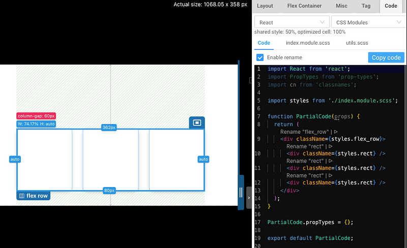
For additional support, the pxCode plugin is free, making the code available even to users without a subscription:

You can copy code without a subscription.
You can "copy code" without a subscription.

Read More

cover

In the ever-evolving landscape of web development, the styling of applications is just as critical as their functionality. For developers wielding the power of React, a popular JavaScript library for building user interfaces, integrating CSS to bring visual zest into their projects is paramount. This guide delves into the art and science of using CSS in React applications, exploring traditional methods, CSS Modules, and CSS-in-JS, alongside code examples and insightful references. As we embark on this stylistic journey, we’ll also touch upon the historical evolution of CSS in React and why developers champion different styling approaches.

Read More

Your browser is out-of-date!

Update your browser to view this website correctly. Update my browser now

×